SANJIESAN Design Notes
Color, material and emotion in the collaboration store.
Field notes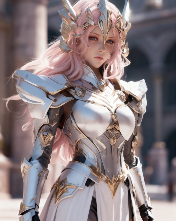
The store uses cream white as breathing room, pink for warmth, sky blue for distance and small gold accents for ceremony. The palette belongs to the SANJIESAN world, but the hierarchy always makes room for real products.
01 · Illustration
Characters identify the world and create companionship. On product pages they remain supporting actors, leaving the commercial object easy to see and understand.
02 · Photography
Real collaboration areas favor product photography and supplied campaign imagery. Illustration may frame the experience, but should not replace evidence of the product.
03 · Motion
Movement stays short and quiet: a hover lift, a soft reveal or a small character detail. It should help orientation rather than delay reading or action.